
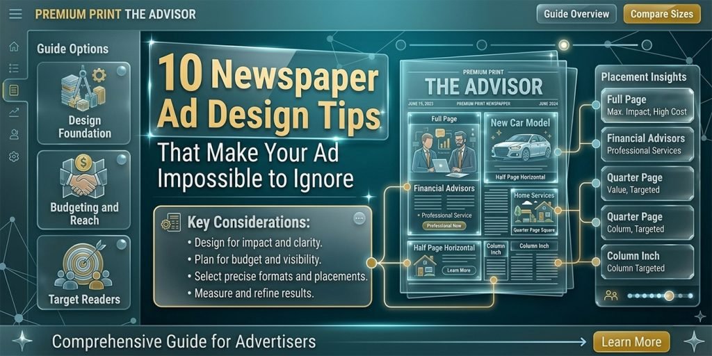
A well-designed newspaper ad stops a reader mid-page and communicates your message in seconds. A poorly designed one gets skipped — or worse, never seen at all. Here are 10 proven design principles our team applies to every newspaper advertisement we create at Graphics Anywhere.
1. Lead with a bold, benefit-driven headline
Your headline is the most important element in the entire ad. Readers scan a newspaper page in seconds — the headline is what decides whether they stop or keep turning. A strong newspaper ad headline focuses on a single, specific benefit your customer cares about. Not what your business does, but what it does for them.
Avoid vague headlines like “Quality products at great prices.” Instead, try “Get 50% off all sofas this weekend only.” Specific, timely, and outcome-focused headlines dramatically outperform generic ones on newsprint.
Design tip
Make your headline at least 2× the size of your body copy. Readers at arm’s length should be able to read the headline before they decide to lean in. If the headline is not legible from a normal reading distance, increase the size — even if it means cutting body copy.
2. Use strong visual hierarchy
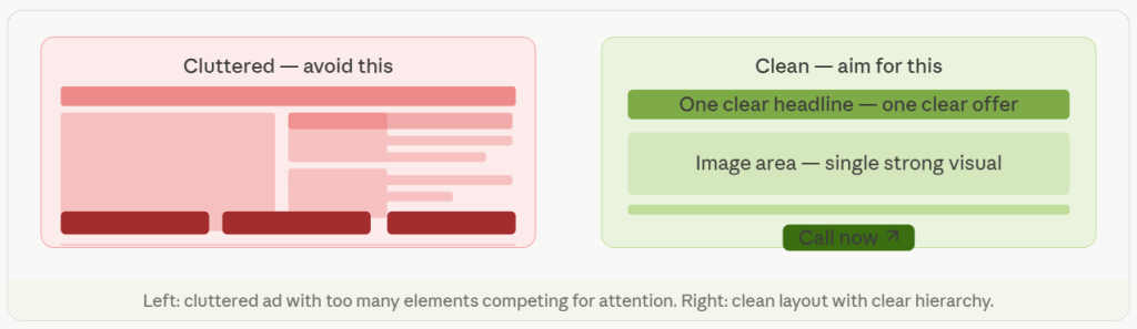
Visual hierarchy is the order in which a reader’s eye moves through your ad. In a newspaper context, this means: headline first, image second, body copy third, call to action last. Every element should lead naturally to the next. If everything is the same size and weight, nothing stands out — and the ad reads as visual noise.
3. Keep it simple — one message per ad
The biggest mistake businesses make in newspaper ads is trying to say too much. One ad, one message. Are you promoting a sale? Focus entirely on the sale. Are you announcing a new location? Lead with the address. Ads that try to communicate five different things communicate none of them effectively.
4. Design for newsprint — not a screen
Newspaper printing is very different from digital display. Ink spreads slightly on newsprint. Fine details get lost. Light colors drop out. Gradients look muddy. At Graphics Anywhere, we design specifically for print conditions:
- Use CMYK color mode — never RGB for print files
- Keep fonts at minimum 8pt for body copy — smaller gets lost
- Avoid very light grays — they often disappear on newsprint
- Use bold, high-contrast color combinations for maximum legibility
- Set image resolution to minimum 300 DPI — lower resolution images print blurry
5. Make your call to action unmissable
Every newspaper ad needs a single, clear call to action. What do you want the reader to do next? Call a number, visit a website, come to a store, redeem a coupon? Put your CTA in a box, use a contrasting color, or make it significantly larger than the surrounding text. The reader should never have to search for what to do next.
6. Use white space strategically
White space — empty space with no content — is not wasted space. It is a design tool. An ad with generous white space around the key elements looks premium, confident, and easy to read. An ad crammed with text and images looks desperate and is harder to process. Give your headline room to breathe.
7. Use a strong, relevant image
A single powerful image outperforms a collage of smaller ones every time. The image should directly support the message — a product, a person experiencing the benefit, or a visual that immediately communicates what the ad is about. Low-resolution, stock-looking, or irrelevant images undermine the credibility of the entire ad.
8–10. Final three principles
8. Include your logo — but do not make it the hero. Your logo should be present but not dominate the ad. The offer and headline are the heroes. The logo confirms who is making the offer.
9. Match the ad to your brand identity. Use your brand colors, fonts, and visual style so readers recognise your business consistently across multiple ads and publications.
10. Always deliver a print-ready file. Your ad must be submitted at 300 DPI minimum, in CMYK, with correct bleed and crop marks. A great design printed poorly still fails — always confirm the publisher’s technical spec before submitting.
newspaper ad design tips, how to design a newspaper ad, newspaper advertisement design, print ad design tips, newspaper ad layout, newspaper advertising design, Newspaper ad design, Print design tips, Advertising design, Graphics Anywhere.
Need a professional newspaper ad designed?
Print-ready in 24 hours — send your brief to get started.