
After designing newspaper ads for clients across dozens of industries and publications worldwide, our team at Graphics Anywhere has seen the same mistakes appear again and again. Here are the seven most damaging errors — and exactly how to fix each one.
Mistake 1 — A headline that fails to stop the reader
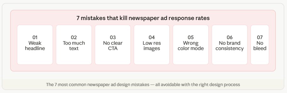
The headline is the first and often only chance to grab a reader’s attention. A headline that describes your business instead of offering a benefit — “Smith & Sons Hardware Store” — is invisible. A headline that speaks directly to what the reader wants — “Fix any tap leak yourself in under 10 minutes” — earns attention and engagement.
The fix
Rewrite your headline to answer: “What is in this for the reader?” Lead with a benefit, a number, or a specific time-limited offer. Test multiple headline options before committing to one.
Mistake 2 — Cramming too much text into the ad
A common instinct is to fill every inch of paid ad space with information — company history, full product list, team credentials, contact details, terms and conditions. The result is an ad that readers scan for half a second and abandon. A newspaper ad is not a brochure. It has one job: to generate a response.
The fix
Cut your body copy by half. Then cut it again. State the offer, explain the key benefit in two or three lines, and get to the call to action. Every word that does not earn its place should be removed.
Mistake 3 — No clear call to action
Readers who find your ad interesting will look for guidance on what to do next. If there is no clear, prominent call to action, they will move on. “Call 0800 123 456 today” is a call to action. “Visit www.yourbusiness.com/sale-ends-sunday” is a call to action. “We are a family-run business established in 1982” is not.
Mistake 4 — Using low-resolution images
Images sourced from websites, social media, or messenger apps are typically 72–96 DPI — fine on screen, completely unacceptable for print. At 300 DPI minimum, a 72 DPI image prints at roughly one-quarter of its screen size. A full-page photo at 72 DPI prints blurry, pixelated, and unprofessional.
The fix
Always source print images at 300 DPI or higher at the intended print size. If high-resolution product photography is unavailable, request it from your supplier or commission a shoot. Never resize a small image to fill a large space — it will always print poorly.
Mistake 5 — Submitting in RGB instead of CMYK
RGB is the color mode for screens. CMYK is the color mode for print. An ad submitted in RGB may look perfect on your monitor but will shift — sometimes dramatically — when converted by the publisher’s production system. Blues can become purple. Vibrant greens can go muddy. Brand colors can look completely different to what you intended.
Mistake 6 — Inconsistent branding across ads
Advertising works through repetition. If your ad looks completely different every week — different fonts, different colors, different layouts — readers never build recognition. Consistent branding across all your newspaper ads creates familiarity, and familiarity builds trust and response over time.
Mistake 7 — Forgetting bleed and crop marks
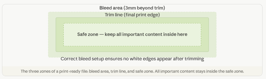
If your ad design goes to the edge of the page, the artwork must extend 3mm beyond the trim line — this extension is called bleed. Without bleed, a tiny misalignment during cutting results in a thin white strip along one or more edges of your printed ad. Publishers will often reject or return ads submitted without correct bleed and crop marks.
Avoid all 7 mistakes — let us design your next newspaper ad.
Print-ready in 24 hours. Send your brief today.