Newspaper Ad

Newspaper Ad

Why Outsourcing Newspaper Ad Design Saves Businesses Time, Money, and Stress

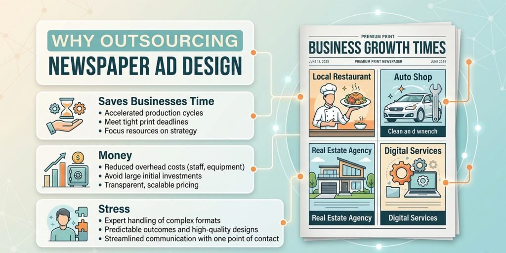
Many businesses attempt to design their own newspaper ads — using in-house staff, basic design software, or DIY templates. The results are often disappointing. Here is why outsourcing newspaper ad design to a professional studio like Graphics Anywhere consistently produces better results at a lower total cost than doing it in-house. The hidden cost of in-house newspaper ad design When a business decides to design its own newspaper ads, the obvious costs are the software and the time. But the hidden costs are often much larger. Staff who are not trained designers take significantly longer to produce an ad — and the result is still often not print-ready. Publishers frequently reject ads with the wrong file format, incorrect color mode, missing bleed, or insufficient resolution. A missed publication deadline means waiting another week — or losing the spot entirely. What a professional newspaper ad designer brings Print-production knowledge. A professional designer understands CMYK, resolution, bleed, and the specific constraints of newsprint reproduction — things that are not intuitive without experience. Publication-specific file delivery. We design to your publisher’s exact technical specifications — so the ad passes the production check first time, every time. Layout expertise. Knowing where to place the headline, how large to make the image, and how much white space to use is a learned skill. Professional designers apply these principles automatically. Consistent brand identity. We maintain your fonts, colors, and visual style across every ad — so readers build recognition over time regardless of which publication they see your ad in. Fast turnaround. We deliver print-ready newspaper ads in 24 hours as standard — so tight publication deadlines are never a source of stress. Client example A retail client came to us after their in-house team had twice submitted ads that were rejected by the publisher — once for wrong color mode, once for missing bleed. Both rejections meant a missed publication date. After switching to Graphics Anywhere, they have not missed a single deadline in over 18 months. The time saved by their team alone paid for the design cost many times over. Is outsourcing right for every business? Outsourcing newspaper ad design makes the most sense for businesses that advertise regularly — weekly or monthly — and for any business that has experienced rejected files, missed deadlines, or inconsistent results from in-house or freelance design. It is also the right choice when advertising in multiple publications simultaneously, where managing different size specifications and deadlines creates real complexity. How Graphics Anywhere makes it simple Our newspaper ad design process is designed to be as simple as possible for you. Share your brief — the ad size, your logo, colors, headline, body copy, and any images — and we take care of everything else. We check the publisher’s technical specifications, design the layout, and deliver a print-ready file in 24 hours. Revisions are unlimited. The file we deliver goes straight to the publisher without any additional production work on your part. Ready to outsource your newspaper ad design? Send your brief — print-ready artwork delivered in 24 hours.
Newspaper Ad

The Complete Guide to Newspaper Ad Sizes — Which Format Is Right for Your Business?

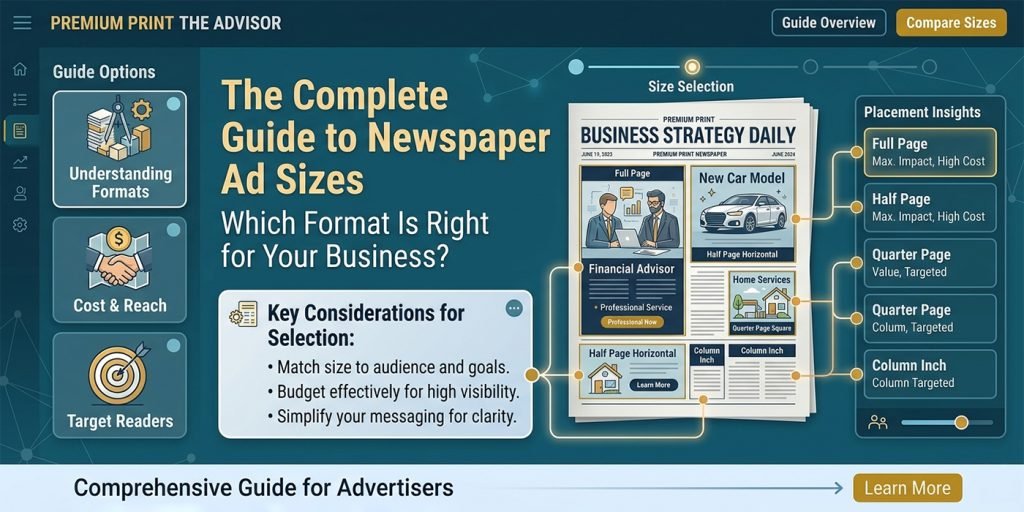
Choosing the wrong newspaper ad size is one of the most expensive mistakes an advertiser can make. Too small and your message gets lost. Too large and you overspend for reach you do not need. This guide covers every standard newspaper ad format, what each is best used for, and how to choose the right one for your campaign goals and budget. Full-page newspaper ads A full-page newspaper ad is the most impactful format available in print advertising. It commands the entire page — no competing content, no distractions. Full-page ads are used for major brand launches, grand opening announcements, significant sales events, and campaigns where maximum visibility is the priority. Half-page newspaper ads A half-page ad offers strong visual presence at a more accessible price point. Available in horizontal and vertical orientations, half-page ads work well for promotions with multiple products or services, where you need enough space to show imagery alongside a reasonable amount of copy. Quarter-page newspaper ads The quarter-page format is the most commonly used newspaper ad size for small and medium-sized businesses. It provides enough space for a strong headline, a supporting image, key information, and a clear call to action — without the budget demands of larger formats. When designed well, a quarter-page ad can punch well above its weight. Design tip In a quarter-page ad, ruthlessly prioritize. One image, one headline, three lines of body copy maximum, one call to action. The discipline of a smaller format forces you to focus on the one thing that matters most — which often makes the ad more effective than a half-page ad that tries to say too much. Strip and banner ads Strip ads run the full width of the page but occupy only a few centimetres of height. They work best as a repeated, frequent format — running in the same position in every issue to build reader familiarity over time. Strip ads are commonly used by local businesses for regular, cost-effective brand presence. Column and single-column ads Column ads are defined by the publication’s own grid — typically one or two columns wide. They are budget-friendly and work well for local service businesses who want a consistent small-space presence in each issue. Well-designed column ads with a strong headline and clear contact information can generate consistent enquiries. Classified ads Classified ads are primarily text-based and grouped by category. They are the most affordable newspaper advertising format and are widely used for job listings, property sales, secondhand goods, and local services. While design options are limited, a well-structured classified with a strong headline and specific details still outperforms a vague one. How to choose the right size 1. Define your goal first. Brand awareness needs visibility — go larger. Direct response for a local service works fine in a quarter page or column. 2. Consider your content. A single product with one offer needs less space than a multi-product sale with pricing and terms. 3. Think about frequency vs size. A quarter-page ad running every week often outperforms a full-page ad running once. Repetition builds recognition. 4. Ask about premium placement. A quarter-page ad on the front page or back cover outperforms a full-page ad buried on page 22 — placement matters as much as size. Need a newspaper ad designed to your exact publication specs? Any size, any format — print-ready in 24 hours.

Newspaper Ad

7 Common Newspaper Ad Design Mistakes That Kill Response Rates (And How to Fix Them)

After designing newspaper ads for clients across dozens of industries and publications worldwide, our team at Graphics Anywhere has seen the same mistakes appear again and again. Here are the seven most damaging errors — and exactly how to fix each one. Mistake 1 — A headline that fails to stop the reader The headline is the first and often only chance to grab a reader’s attention. A headline that describes your business instead of offering a benefit — “Smith & Sons Hardware Store” — is invisible. A headline that speaks directly to what the reader wants — “Fix any tap leak yourself in under 10 minutes” — earns attention and engagement. The fix Rewrite your headline to answer: “What is in this for the reader?” Lead with a benefit, a number, or a specific time-limited offer. Test multiple headline options before committing to one. Mistake 2 — Cramming too much text into the ad A common instinct is to fill every inch of paid ad space with information — company history, full product list, team credentials, contact details, terms and conditions. The result is an ad that readers scan for half a second and abandon. A newspaper ad is not a brochure. It has one job: to generate a response. The fix Cut your body copy by half. Then cut it again. State the offer, explain the key benefit in two or three lines, and get to the call to action. Every word that does not earn its place should be removed. Mistake 3 — No clear call to action Readers who find your ad interesting will look for guidance on what to do next. If there is no clear, prominent call to action, they will move on. “Call 0800 123 456 today” is a call to action. “Visit www.yourbusiness.com/sale-ends-sunday” is a call to action. “We are a family-run business established in 1982” is not. Mistake 4 — Using low-resolution images Images sourced from websites, social media, or messenger apps are typically 72–96 DPI — fine on screen, completely unacceptable for print. At 300 DPI minimum, a 72 DPI image prints at roughly one-quarter of its screen size. A full-page photo at 72 DPI prints blurry, pixelated, and unprofessional. The fix Always source print images at 300 DPI or higher at the intended print size. If high-resolution product photography is unavailable, request it from your supplier or commission a shoot. Never resize a small image to fill a large space — it will always print poorly. Mistake 5 — Submitting in RGB instead of CMYK RGB is the color mode for screens. CMYK is the color mode for print. An ad submitted in RGB may look perfect on your monitor but will shift — sometimes dramatically — when converted by the publisher’s production system. Blues can become purple. Vibrant greens can go muddy. Brand colors can look completely different to what you intended. Mistake 6 — Inconsistent branding across ads Advertising works through repetition. If your ad looks completely different every week — different fonts, different colors, different layouts — readers never build recognition. Consistent branding across all your newspaper ads creates familiarity, and familiarity builds trust and response over time. Mistake 7 — Forgetting bleed and crop marks If your ad design goes to the edge of the page, the artwork must extend 3mm beyond the trim line — this extension is called bleed. Without bleed, a tiny misalignment during cutting results in a thin white strip along one or more edges of your printed ad. Publishers will often reject or return ads submitted without correct bleed and crop marks. Avoid all 7 mistakes — let us design your next newspaper ad. Print-ready in 24 hours. Send your brief today.

Newspaper Ad

10 Newspaper Ad Design Tips That Make Your Ad Impossible to Ignore

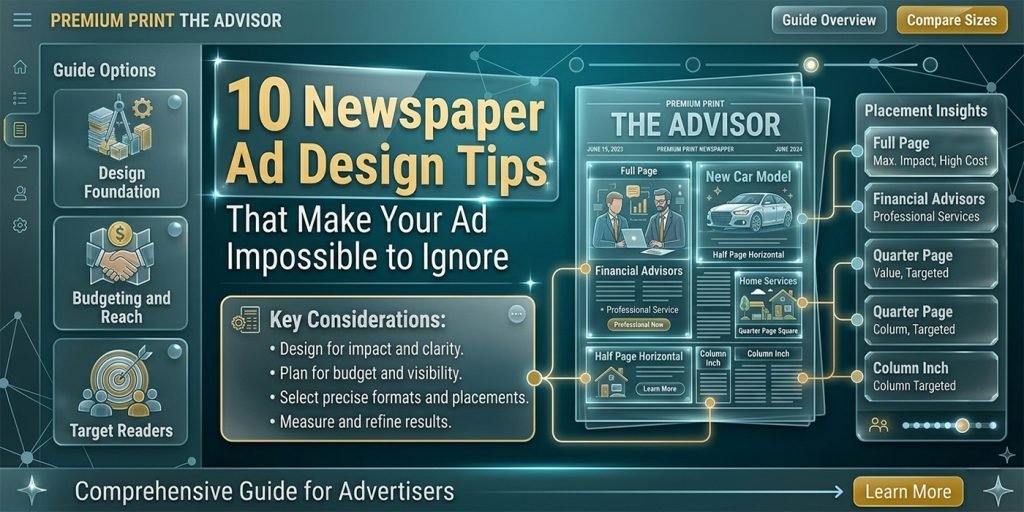
A well-designed newspaper ad stops a reader mid-page and communicates your message in seconds. A poorly designed one gets skipped — or worse, never seen at all. Here are 10 proven design principles our team applies to every newspaper advertisement we create at Graphics Anywhere. 1. Lead with a bold, benefit-driven headline Your headline is the most important element in the entire ad. Readers scan a newspaper page in seconds — the headline is what decides whether they stop or keep turning. A strong newspaper ad headline focuses on a single, specific benefit your customer cares about. Not what your business does, but what it does for them. Avoid vague headlines like “Quality products at great prices.” Instead, try “Get 50% off all sofas this weekend only.” Specific, timely, and outcome-focused headlines dramatically outperform generic ones on newsprint. Design tip Make your headline at least 2× the size of your body copy. Readers at arm’s length should be able to read the headline before they decide to lean in. If the headline is not legible from a normal reading distance, increase the size — even if it means cutting body copy. 2. Use strong visual hierarchy Visual hierarchy is the order in which a reader’s eye moves through your ad. In a newspaper context, this means: headline first, image second, body copy third, call to action last. Every element should lead naturally to the next. If everything is the same size and weight, nothing stands out — and the ad reads as visual noise. 3. Keep it simple — one message per ad The biggest mistake businesses make in newspaper ads is trying to say too much. One ad, one message. Are you promoting a sale? Focus entirely on the sale. Are you announcing a new location? Lead with the address. Ads that try to communicate five different things communicate none of them effectively. 4. Design for newsprint — not a screen Newspaper printing is very different from digital display. Ink spreads slightly on newsprint. Fine details get lost. Light colors drop out. Gradients look muddy. At Graphics Anywhere, we design specifically for print conditions: 5. Make your call to action unmissable Every newspaper ad needs a single, clear call to action. What do you want the reader to do next? Call a number, visit a website, come to a store, redeem a coupon? Put your CTA in a box, use a contrasting color, or make it significantly larger than the surrounding text. The reader should never have to search for what to do next. 6. Use white space strategically White space — empty space with no content — is not wasted space. It is a design tool. An ad with generous white space around the key elements looks premium, confident, and easy to read. An ad crammed with text and images looks desperate and is harder to process. Give your headline room to breathe. 7. Use a strong, relevant image A single powerful image outperforms a collage of smaller ones every time. The image should directly support the message — a product, a person experiencing the benefit, or a visual that immediately communicates what the ad is about. Low-resolution, stock-looking, or irrelevant images undermine the credibility of the entire ad. 8–10. Final three principles 8. Include your logo — but do not make it the hero. Your logo should be present but not dominate the ad. The offer and headline are the heroes. The logo confirms who is making the offer. 9. Match the ad to your brand identity. Use your brand colors, fonts, and visual style so readers recognise your business consistently across multiple ads and publications. 10. Always deliver a print-ready file. Your ad must be submitted at 300 DPI minimum, in CMYK, with correct bleed and crop marks. A great design printed poorly still fails — always confirm the publisher’s technical spec before submitting. newspaper ad design tips, how to design a newspaper ad, newspaper advertisement design, print ad design tips, newspaper ad layout, newspaper advertising design, Newspaper ad design, Print design tips, Advertising design, Graphics Anywhere. Need a professional newspaper ad designed? Print-ready in 24 hours — send your brief to get started.

Scroll to Top